Branding Services: Strategy, Identity Systems and Digital Assets
A brand is more than a logo. How we build brand strategy and identity systems that work on screens first and carry through into your product interface.
Maybe you’re launching a product. Maybe the identity you started with no longer fits the company you’ve become. Either way, a logo alone won’t cover it. Good branding services give you a clear idea of who you serve and why they should choose you, an identity system that’s recognizable wherever it appears, and assets your team can use without calling a designer for every banner.
The real test is how the brand holds up where people actually meet you. That might be an app store listing, a link preview in a group chat, the first screen after sign-up or an email in a crowded inbox. If it looks right on a presentation slide but falls apart at favicon size or in dark mode, it hasn’t done its job.
What our branding services include
A brand is the impression people form of you from everything you show and say. Nobody can design an impression directly. What we can do is design the parts that shape it and keep them consistent. The work moves through research, concept and design, and covers:
- Brand strategy, covering positioning, audience, personality, the promise you make and the messages you lead with.
- Verbal identity, from voice and tone to naming exploration, taglines and the vocabulary your product uses.
- Visual identity, including the logo suite, color, typography, iconography, illustration and photography direction, and motion.
- Digital assets such as app icons, favicons, social profile and sharing images, email and presentation templates, and store listing visuals.
- Guidelines and libraries your team can work from: a practical brand guide, a Figma library and design tokens that engineers can import.
Some clients are new companies building a brand from scratch. Others are established and need a rebrand or, more often, a careful refresh.
Strategy comes before the logo
Starting with logo sketches is the quickest way to waste a branding budget. If nobody has agreed on positioning, every design review turns into an argument about taste.
We start with research instead. That means workshops with the founders and main stakeholders, conversations with customers where we can get them, and a review of how competitors present themselves, both visually and in what they claim. We’re looking for the space you can credibly own: what you do better or differently, put in words your customers would actually use.
The output is a short brand platform, a few pages rather than a thick book. It says who you serve, the problem you solve, what you promise, how you sound and what you’re not. Everything after it is briefed from this document, and your team will keep checking new work against it long after the project ends.
With an early-stage startup, we keep all of this proportionate. At that stage you need a sharp position and a flexible starter identity. A system designed for a company several stages ahead of you would be wasted, and you can invest more once you know which audience is really buying.
Identity systems, not just a logo
The logo is one part of an identity system, and often not the part people see most. It’s the rest of the system that makes your product recognizable when the logo is nowhere on screen.
Logo suite
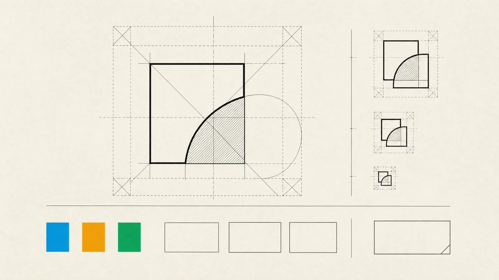
We design a primary logo plus the variants you’ll actually use: a compact mark for small spaces, a one-color version, and versions for light and dark backgrounds. Every one of them is tested at real sizes, down to a browser tab and a notification icon.
Typography
Choosing a typeface has practical consequences. Font licenses often differ for desktop, web and app embedding, so we either confirm the license covers every place you’ll use the font or pick a high-quality open-source family. Language coverage gets checked early too. Turkish characters such as ğ, ş and ı, or any other script you plan to support, belong in the decision from the start rather than as an afterthought.
Color
We define the palette as roles with tested pairings. You can see which text colors meet accessible contrast on which backgrounds, in both light and dark themes. A vivid brand color that fails contrast on white is still useful, as long as it’s kept to the jobs it can do.
Imagery, icons and motion
Illustration style, photography direction, an icon style and a few motion principles round out the system. They’re what make a screen look like yours when there’s no logo on it.
Digital-first brand assets
Most people meet your brand on a screen, often a small one, and often inside someone else’s interface. So we design for those contexts first:
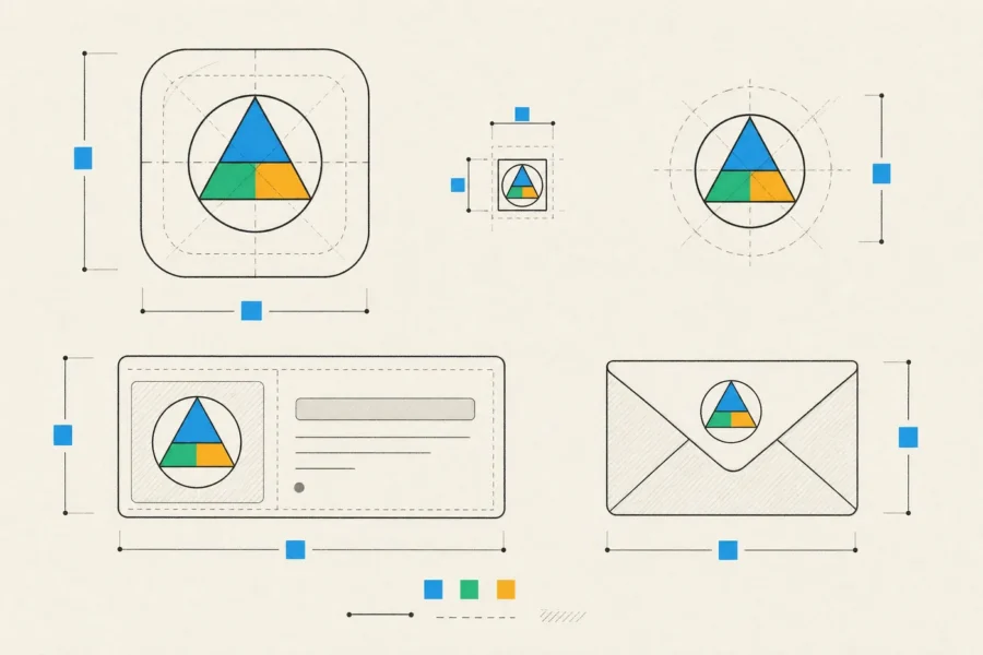
- App icons that follow each platform’s rules. iOS applies its own corner mask. Android uses adaptive icons, with separate foreground and background layers inside a safe zone. Both platforms can now tint or theme icons, so the mark has to read in a single color.
- Favicons and small marks, simplified so they stay legible at tiny sizes.
- Social avatars that survive a circular crop, and cover images that leave room for the profile photo placed over them.
- Link preview templates that give every shared page a consistent, on-brand card. We cover the metadata behind them in social media optimization.
- Email templates that still look right when some email clients invert colors in dark mode.
- Store listing visuals for the App Store and Google Play, built as editable templates.
You get editable masters for everything, plus ready-to-use exports: SVG for the web, and correctly sized raster files wherever a platform requires them.
How branding connects to product UI
For a software company, the product is where people spend the most time with your brand. Users notice when the marketing site feels confident and the app feels generic. That’s why we treat branding and UI/UX design as one conversation.
The identity gets translated into design tokens. Colors become roles such as primary, surface, text and error instead of raw hex values, alongside a type scale, spacing, corner radius and elevation. Tokens carry more personality than people expect. Tight corners and dense spacing read as precise, while generous spacing and rounded shapes feel friendly. Engineers import the same tokens into code, which keeps the product in sync with the guidelines as both evolve.
Voice matters as much as the visuals. Users hear your brand most often in error messages, empty states, onboarding and confirmations, so the brand platform gives writers and designers rules for how you sound when something goes wrong, as well as in headlines.
We’re deliberate about where the brand stops. In a dense product interface, usability comes first, which means platform conventions, readable type and predictable controls. The brand should come through in the details rather than compete for attention. Pages on your website can afford to be louder than the product.
How a branding engagement works
A branding project goes through five stages, and each one ends with a review:
- We start with discovery: workshops, interviews and a competitor review.
- Next comes the brand platform, which we agree on before any visual work begins.
- Then we present a small number of distinct concept routes. Each comes with its reasoning and is shown in real contexts such as an app screen, a store listing and a social post.
- Once a route is chosen, we develop it into a complete identity system.
- Rollout covers guidelines, asset production, templates and, if you want it, implementation in your website and product.
Our designers lead the work. A business analyst supports the research, and engineers join when the identity moves into code. At the end you have the brand platform, the logo suite with all master files, brand guidelines, a Figma library, design tokens and the templates your team will use every week.
Sometimes the full process is the wrong call. If you need a presentable mark for a pitch in a few days, we’ll suggest something lighter now and a proper process later. If your current brand already has real recognition, a refresh that keeps that equity is usually wiser than starting over. And if customers are leaving because of the product itself, a new identity won’t change that.
Frequently asked questions
Do we need a rebrand or a refresh?
If people recognize and trust your brand, and the problem is inconsistency or dated execution, refresh it. Keep the core elements and rebuild the system around them. A rebrand makes sense when your positioning has changed, when you’ve merged or pivoted, or when the current identity is actively working against you.
Can you work with our existing brand guidelines?
Yes. A lot of guidelines were written for print and presentations. We fill in the digital gaps, like dark mode, accessible color pairings, app icons, tokens and templates, and leave alone what already works.
Do you handle naming and trademarks?
We run naming exploration and check practical availability, such as domains and social handles. Trademark searches and registration need a qualified IP attorney, and we recommend bringing one in before you commit to a name.
How many concepts will we see?
A few routes that are genuinely different from each other, each with a rationale and shown in realistic contexts. Dozens of variations would only make the decision harder.
Is branding worth it for an early-stage startup?
Yes, if it’s kept proportionate. A clear position, a solid wordmark, a palette with accessible pairings and a type system can carry you through launch. They also make every later piece of design faster and more consistent.
If you’re naming a new company or bringing an established brand into your product, send us a list of the places your brand has to work, from the app icon to the email footer, and we’ll propose an approach that fits your stage.